Or, wished to break your phone because of a specific app?
This is not an uncommon scenario. We all have landed on a website (or app) that we die to quit.
The website (or app) that doesn’t understand the concept of user-friendliness.
Either they are too slow, or too complicated.
Whatever the reason is it makes the users annoyed.
But, there are some UX design principles that every designer should keep in mind to provide the best user experience.
Before we move towards principles of UX design, let’s take a glimpse of What is Ux design?
It is important to start by saying that UX design has no commonly accepted definition.
UX design has multiple dimensions.
It includes interaction design, information architecture, usability, visual design, human-computer interaction, etc.
Don’t get confused!
We will clear your doubts on what is UX design.
UX design in a simple term is improving customer satisfaction and experience through utility, ease of use and pleasure provided during the interaction with the product.
In other words, UX design means designing a product (digital/Physical) which is easy to use, helpful and enhances the user experience.

But unfortunately, this is also not a complete definition of UX design.
Through our experience in this field, we have learned a few more in-depth definitions of UX design that define them in a more versatile way.
This means that a UX design should consider all the aspects of a product.
It should not focus on the beauty and function of a product only but also consider things like delight and emotion.
UX design starts with studying who your customers are and what are their requirements.
And, then designing a product that will work well for those who will be using it.
User experience is impacted by decisions that are made in the organization.
Take the example of Disney Magicband.
Despite not having a graphic user interface it provides an amazing experience by using sensors and well-implemented customer service.
You must now have understood that UX design has multiple interpretations but one thing is constant.
It is all about giving your users the utmost importance and keeping them at the center of everything you create.
A professional UX design company can help you with creating a quality UX design. A design which is user-centric and can make users fall in love with.
Now let’s move towards UX design principles.
Taking care of user’s need is the most important Ux guiding principle.
The term user experience itself makes it clear that your design needs to be user-centric.
For this, you have to learn what users are looking for in a product or service?
It can be that a design you loved might not attract the users.
So, you need to work on a design that will engage them.
Users are unique individuals with their likes, dislikes, experiences, and expertise.
You can learn about them through user testing.
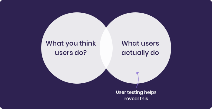
Below are the steps you need to follow for user testing
A prototype is an early model of your product.
It is built with limited functionality.
There are various ways through which you can create a prototype.
You can use various online apps and offline software for creating one.
I will tell you some basic way to do it
You can draw some sketches on a piece of paper.
Take pictures of them and then join them together.
You can join them using a tool like Adobe Experience Design
You can also create interactive wireframes and can string them together.
For this use online prototyping tools like InVision or UXpin
Layout a plan for the test otherwise you will end up wasting a lot of time.
Your plan should include
What you are going to test, (features, functionality, tasks)
How you test it?
As mobile apps are extremely beneficial for any business, so let’s say you are testing a mobile app for a public transportation route planner.
For which you have designed three main features: journey planning, ticket ordering, and seat reservations.
You must have a group of target users in mind who use public transport for their daily commute.
Now you need to find out from those users whether certain features or functionality of your app is user-friendly or not.
You can jot down several questions like:
Are users able to plan their journey effectively?
Are they ordering tickets easily and quickly?
Will, they can reserve a seat without any hassle?
You are ready with your full-fledged plan. Now you only need to execute it.
As you are ready with your plan it’s time to recruit some actual users.
If you are working on an in-house or small project you can reach out to your friends, who fall in your target audience.
You can also ask for a referral.
If you are working on some big projects or with external clients you can take the help of these tools clicktale.com, verifyapp.com, usertesting.com, etc.
We would recommend you to go for testing in person then remotely.
Through testing in person, you would be able to read their body language and signs like tension, stress.
You will also be able to find out the areas in which they are struggling by reading their facial expressions.
Chances of missing these things are high if you are testing remotely or on skype.
Now, how to know which testing location is good?
Well, choose a location with a minimum distraction.
Cafes are a great place to meet with your users and perform the test.
You can also choose other peaceful location for performing the test.
The success of the test completely depends on your ability and the way you communicate with your users.
Here your preparation and the test plan you made will come in.
We would recommend you to first do a little bit of practice with your partner and family members.
Tell your users to treat your product as a real product and then give you their honest feedback.
Now pen down everything you found in your test carefully.
You can also make a spreadsheet consisting of all the important points or opt for video recording.
Designing involves a lot of work, and that’s the reason you should have a clarity of where you are in the process.
Here are the reasons why you should know your position in the design process:
Provides flexibility to the team
Saves you from the last-minute hustle
Scales growth and productivity
Prevents bad copy in production.
For instance, your team is busy deciding the color of the button without figuring out where it should be placed in the design.
That’s why it is important to know where you are in the design process.
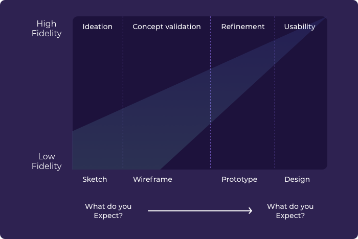
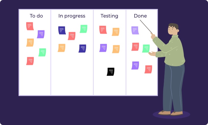
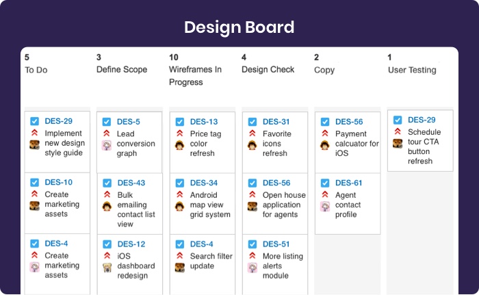
You can create a design board for your team to know their position in the design process.
It’s your choice whether you want to go for a physical board or a digital board.
In the physical board, your team can come with blackboard or whiteboard and place sticky notes on it.
For making a digital board you can use free tools like Trello and Taiga.
The third UX guiding principle that needs to be taken into consideration is Hierarchy.
Hierarchy is the tool that helps the user to navigate through a product easily.
Hierarchy is classified into two broad categories:
It is associated with how content is organized throughout the design.
This is the primary navigation menu, it includes the main section.
This is the first thing that a user notices when he/she arrives on your website.
When they click on this they will find further subcategories of content open up.
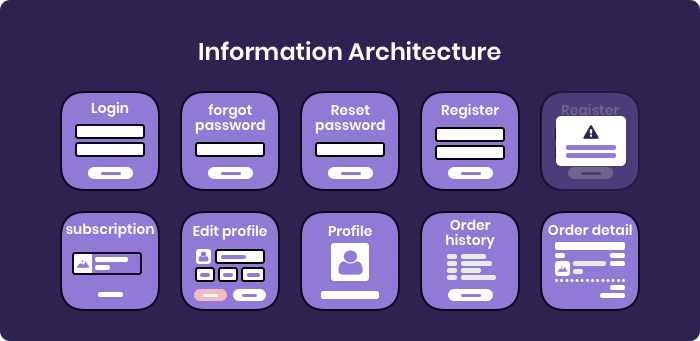
Those content will drive you deeper into the site.
Most designers overlook this hierarchy as it looks obvious.
But, it is an essential step if you want a smooth navigation flow.
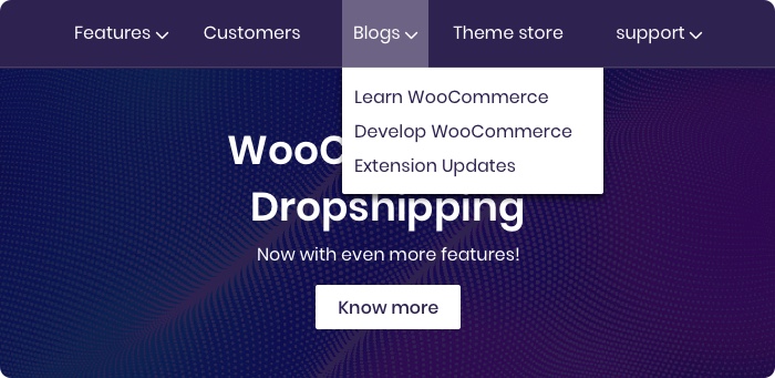
Through visual hierarchy, a user can navigate easily within a page or section.
Your important content should stand out in a visual hierarchy.
For this, you need to concentrate on making your heading larger than your body text and using a different font and weight.
Also, include interactive elements to draw the user’s attention.
It is good to be creative and have a bag full of new ideas.
But don’t make your design completely different from other similar products.
It will annoy the users and they will discontinue using your product.
Users want the product to be a little similar to other products they regularly use.
This is called “External Consistency”.
This will help them to easily get familiar with the product without struggling much. So, try to make your product similar to other products.
The more familiar your product will be the better experience it will provide to the user.
Thus, for the basics try to stick to the standard pattern.
In the below-given picture, you can see that the Action Button is at the right of both the apps.
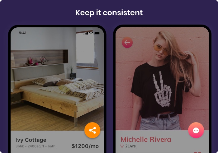
Now the question arrives at, how to do it?
How you will make your product consistent with other products?
Take the help of “Design Languages” for this.
A design language will tell you the guidelines which you need to follow to design a product for a particular device or format.
For instance, if you are designing an app for iOS then you can consider Apple’s Human Interface Guideline.
And if you are designing an app for Android then check Google’s Material Design Guideline, you can also check Android’s guidelines.
Consistency should be there not only with other products but within the product also.
Consistency within a product is called “Internal Consistency”, it has two main parts.
Topography, space, size, colors, and positions need to be defined in one place and then used across the system that you are designing.
It will help the users to explore and learn the system quickly.
Do you want your user to hear multiple voices?
Of course No,
Then make your language and tone consistent throughout the product.
If you want to talk in a funnier tone do that throughout the product.
Or you want your tone to be concise or professional do it for the entire product.
Consistency is one of the basic UX Design Principles. Never ignore it!
Accessibility simply means designing a product in such a way that even the user with a disability can use it easily.
The goal should be making the product universal so that everyone should be able to use the product with ease.
As per this UX design fundamental, all UX designers must remove the obstacles.
There are various Accessibility Testing Tools like Wave, Image Analyzer which you can use to check the accessibility of your product.
You should consider the below two while working on accessibility.
You can use strong color contrast to align your design to make it more accessible.
You can use The WebAim Color for this purpose.

If you want your design to reach as many people as possible, you should use more than just color to indicate a status change.
Color is a standard way to show a status change but it might not be helpful to people with color blindness or other visual differences.
You can pair the color with icon, shapes, explanatory text.
You can also try the combination of all these.

You should design your product with the user’s context in mind.
For creating a great design and appropriate content you first need to understand the context the user is in.
Sometimes the designers confine context up to the location only.
Location indeed is an important factor.
It determines whether you are designing for someone on the go or someone sitting at a desk.
But there are other factors also which should be included for this UX design principle
This is a factor that you can not ignore these days.
The device which the user is using lays a greater impact on how they will interact with your site.
For instance, the interactions will be completely different on the iPhone from the Apple TV with Siri remote.
The stress level and the temperament affect how patient user is with user interference and how much time they are willing to give it.
Time is a valuable commodity.
They will switch to your competitor if they think your product will waste their time.
So consider the emotional state and time of the user while designing an app.
Are your users comfortable while interacting with your product?
They might not be if they are using your product while standing in a crowded place.
Or, there might be some disability.
That’s the reason you should consider all these factors while designing a product.
This was originally proposed by architect Ludwig Mies van der Rohe.
It emphasizes simplicity and opposes decoration in a design.
For the UX design principle this Simple means: reducing the cognitive and operational cost of the users.
Following the Less is More philosophy Apple streamlined the Phone’s keyboard.
Google’s search page also works on this principle.
If you are designing a website or an app here are some important features that you should know.
ONLY include features that are essential in your design
Remove all the unnecessary elements and content that are not required in your design.
Fever elements will result in a lower cognitive load of a user.
Negative space is just a white space between visual elements.
The more space you can provide the better emphasis it will give on the existing elements.
You should eliminate all unnecessary elements if you want to provide a stress-free and engaging experience to the users.

You need to be creative with visual hierarchy if you are designing with fewer elements.
Below is the example of We Ain’t plastic, you can see how beautifully the white background is contrasting with the black gemstone.
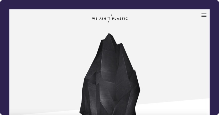
Designers tend to avoid this UX design Principle, but it affects the adaptability of your product.
Simple language enhance your design’s user-friendliness.
You should avoid technical terms in your UX focused copywriting.
Users are always on the go so use words in your design that users can easily understand.
Use the Plain language rule, it will help your users to understand and engage with your content in a better way.
Plain language also makes the user’s digital experience more reachable.
There are a set of principles that every designer should follow.
Use active voice rather than passive voice
Using active voice will increase readability and decrease ambiguity.
The boy was bitten by a dog is an example of passive voice.
The dog bit the boy is an active voice.
So try to use active voice as much as possible.
Write short sentences with shorter words.
Avoid slangs, idioms, acronym, etc.
You should follow the 8th-grade reading level, yes, that’s what the readability rule says.
Take the below example, the word “OK” is not appropriate, they could have used “Yes” instead.

You can check the readability of your website text or copy by using the readability tool like Readable.com, Gunning Fog Index, Grammarly, etc.
Typography plays an important role in creating a good user experience.
If you want your users to read and understand your text without struggling then you should take special care of typography in your design.
There are five basic typography terms
Character: A single element like a letter or a number.
Typeface: A collective name of a family of similar fonts.
Font: An individual member of a typeface, e.g, Arial Bold
Font size: The size of the text characters measured in units
Serif - The decorative line that is added at the original form of character.
There are a lot more but these are some basics which every designer should know.
Now let’s go over an important aspect of usability that is Legibility.
Legibility refers to how effortlessly a user can distinguish individual characters.
Similar shapes of letters can create a problem for the users, especially with that of dyslexia.
So, make sure that the font you choose is legible.
There are some guidelines that you can follow to create a legible text
Use serif, as it will help with legibility.
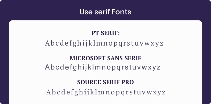
Don’t mess with the spacing between letters and words.

Upper text case tends to slow down the reading process, so go easy with them.

Low color contrast can create legibility problems, so go for higher color contrast.

Visual Feedback is also one of the UX Design Principles that should not be ignored.
Tells the users what is happening and what is going to happen next without them users will be left guessing or getting frustrated.
When a user clicks on something than in return they need a response from the product to understand that the product has got the command.
You can show it in various ways throughout your design.
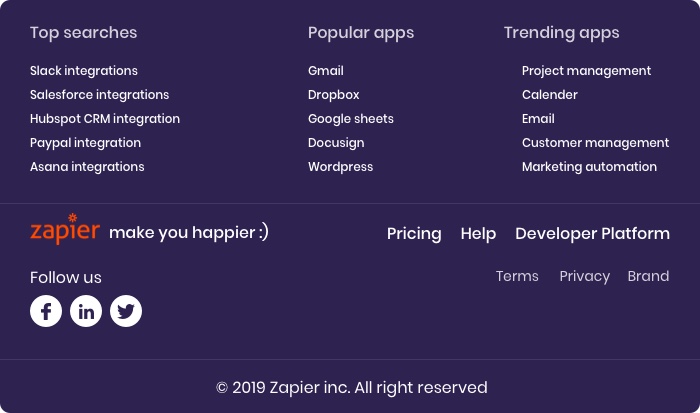
You can change the shape, discolor, emit light, etc of the icon.
You can use the tool Zapier for this.
As a designer, it’s your key goal to prevent an error.
And how will you do that?
By confirming twice.
User’s experience is severely affected when they accidentally delete an item or make an unintended payment.
That’s why it is important to ask for confirmation for permanent actions.
Confirmation allow users to reverse an unintended action or help them to rethink if they are not sure of something.
One common example of this is your order confirmation screen, where a user can review their order details before making the final payment.
Another example that we see a lot is “Are you sure you want to permanently delete this.
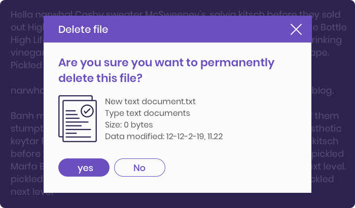
As a designer, you should keep in mind that these confirmation actions require an extra effort.
So, use them for actions that will have a significant effect.
In the below example, Gmail asks users to confirm before deleting the mails in bulk.
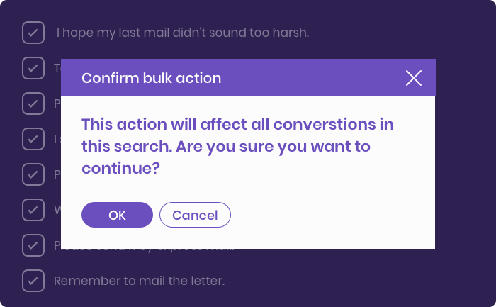
Your user experience will decrease if your users can not smoothly backpedal, or recover from an error.
So while making the UX design do consider this UX design principle carefully.
Give your users the freedom to undo an unwanted action.
You can do it by providing a button that can take them back to where they have clicked.
You must have seen a ‘cancel button’ when you create a new item like an event or email that allows you to abandon the task.
The ‘edit’ or ‘delete’ comment feature on social media sites is one such great example.
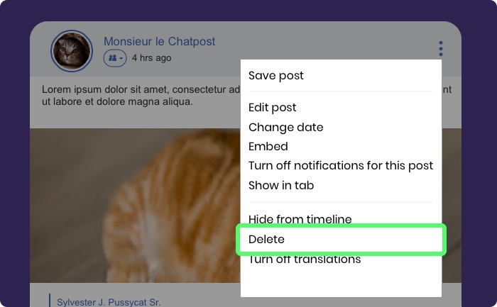
Gmail undo sent message feature and WhatsApp’s deleting message feature are also some examples of user control.


So, your user design needs to provide enough flexibility to your users so that they can reverse their actions.
If you want to attract users your design should showcase a character that interests the users.
User’s don’t get connected with lifeless design, device or code. But with something that has a human touch.
You can provide them a human touch by adding personality to your design.

Visual grammar plays a significant role in user experience.
It consists of icons, patterns, illustrations, and many more. It consists of all visual elements that make a design.
When you break these elements you will get the core elements of Planes, Points, and lines.
As a designer, you should have a good knowledge of these elements.
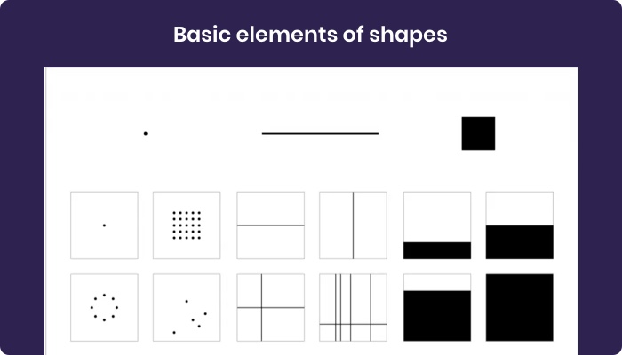
This requires time and practice. But you need to work on them if you want your design to look good.
One way of doing this is that you practice first with just points, lines and planes.
Narrative design nowadays has become an important UX design fundamental.
It means telling a story with your design.
Your user experience will improve if the users will feel that they are not looking at pixels, but there are people behind this trying to tell them a story.
So, make your product more human, and attract your user’s through stories of your brand.
The narrative design has two essential storytelling elements: Time and Rhythm
Time tells the pace your design is going to adopt. For instance, how slowly or quickly your narrative works.
If it is too slow it will bore the user or if it is too fast it will fail to convey its message.
Whereas, rhythm is the pattern that your design will adopt.
Your design needs to form a balance between both pace and rhythm.

Technology functions on binary but humans don’t.
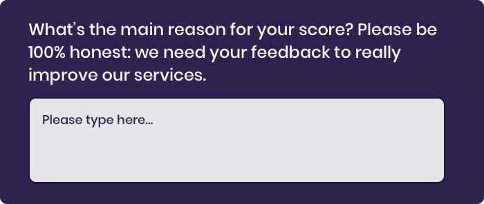
If you want to make a connection with your users you need to ask them questions that feel like humans.
That’s the reason you should ask open-ended questions like “Tell us about your experience from when you logged in”.
Through this, the users will be able to express what they feel and why they feel so.
Rather than close-ended questions like “Do you like this application.” which leaves users with only two choices either Yes or No.
One more advantage of open-ended questions is that you would be able to know the areas that users are not satisfied with your app so that you can work on it.

A pretty-looking design will indeed please the user but it will be of no use if the design fails to stand on the basic functionality.
That’s the reason you should first work on the functionality of your product and then on aesthetic.
Never mix art and design.
Art should come once you are done with your design.
So give utmost priority in making the functionality of your app better, because, in the end, it is something that will solve the user’s problems.
A company of experienced app developers can make an app that users will drool on.

The global temperature is rising.
Our smartphones and digital activities are hampering the environment.
As a designer, you need to keep this Ux guiding principle on priority and need to go green with your design.
You can reduce the carbon footprint and make your design more energy cautious.
Also, users are preferring environment-friendly designs.
They are discouraging anything that can potentially damage the environment.
You can make your website eco-friendly by the following:
Improving Content Findability of website pages
Optimizing the design
Make your UX more accessible
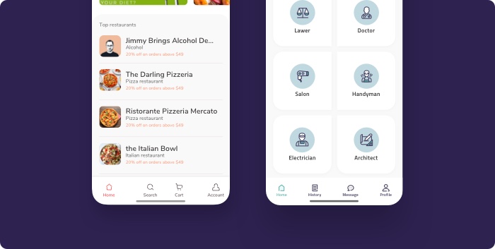
The service which you are providing is just a small part of the digital universe that your user live in.
So, when you are creating your UX make sure you understand the conventions that will fit your product.
For basics, you can be standard but find some moments where you can put the creative touch in your design. But make that choice wisely.
All your efforts will go in vain if you fail to prove the credibility of your website or app amongst the users.
If you want to establish a good user experience then you need to demonstrate your website’s credibility.
There will be no breaking experience for the users if a content that first seems to be useful turns out to be serving only the purpose of selling.
We are not saying that you need to run a free private school.
But as users are sacrificing their time on your website/app you also need to invest your time and energy.
You can make your website credible by following all above 18 principles properly

Today user experience is the key if you want to be successful in the world of digital marketing.
A website/app that is just designed for vanity or aesthetic reason will never survive.
You need to tailor your product as per buyer personas, needs, likes, etc.
The above UX design principles and best practices require a lot of effort and a considerable amount of patience.
But following the UX design principles properly you will be able to provide a greater and long-lasting experience to your users.
Let us help you build custom software solutions that scale your business. Get in touch to book a free consultation now.